Shirt Color Helper for Amazon, Redbubble and Zazzle
I create customizable merchandise and other products for sale through shops offering a Print On Demand service including Amazon, Redbubble and Zazzle. To help choosing colors for texts and graphics that go well with the colors available for different t-shirt design options, I created the Shirt Color Helper tool.
How to Use the Shirt Color Helper
The Shirt Color Helper is hopefully easy to use and self-explanatory. Nonetheless, I'll explain what it does and how to use it.
Right on top you can pick the text color you want to use for printing on a shirt, by default it is set to black.
In the first tab pane below you see the different colors you can pick on Amazon Merch on Demand when creating a shirt. Colors are displayed in rectangular boxes with the phrase "Sample Text" printed on top in the selected text color. Below each box you see the shirt color name and whether the contrast with the text color is okay to use.
When you choose a different text color, the sample texts and contrast indicators are updated on the fly. The remaining tabs do the same for Redbubble, and Zazzle, the latter being divided in light and dark shirt colors.
Move the mouse over a color box or name to see the corresponding RGB and hex values of the shirt color. Please note that color values for Heather type shirts are an approximation, since these types of shirts don't have a single color.
What Contrast Values are Okay?
Choosing a good color combination is not only a matter of good contrast, but readability matters especially when printing meaningful text.
Whether the contrast of a color combination is indicated as okay to use (✔) or not (✘) is based on recommendations and formulae from the Web Content Accessibility Guidelines.
A contrast ratio of 3 or higher (WCAG Level AA for large scale text) for shirt and text colors passes as okay, assuming that the font sizes used on shirts are larger than 18pt or 14pt bold. The calculated ratio is shown in a tooltip, when you move your mouse over the indicator icon next to the shirt color name. Values range from 1 to 21, the higher the better the contrast.
If you find the Shirt Color Helper useful, share it with your shirt-creating friends and don't forget to check out my products to see if you find something nice for yourself or someone you love.
Happy shirt creation!
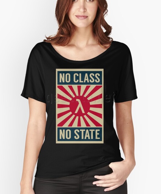
Featured Merch
Latest Posts
- Social Media Dimensions Cheat Sheet 2026
- How to Check if an IP Address is Blocked on Linux
- How to Inspect All Cron Jobs on a Linux System: A Sysadmin's Guide
- Building a 3D Elevation Photo Diary with deck.gl
- Thunderbird Keeps Threading Emails? Here's the Fix
Featured Book

Subscribe to RSS Feed
Published by Ramiro Gómez on . Subscribe to the Geeksta RSS feed to be informed about new posts.
Tags: design print on demand
Disclosure: External links on this website may contain affiliate IDs, which means that I earn a commission if you make a purchase using these links. This allows me to offer hopefully valuable content for free while keeping this website sustainable. For more information, please see the disclosure section on the about page.