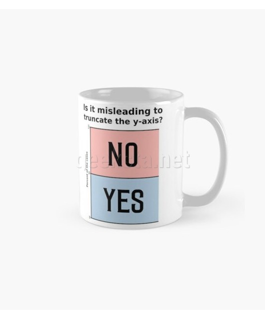
Is it misleading to truncate the y-axis? Funny Chart

Want a custom version of this design? Send me a request.
Truncating the y-axis when visualizing data can often be misleading. When done with bar charts this is most probably intended, for line charts it can be okay if explained. This design consists of the question "Is it misleading to truncate the y-axis?" and a bar chart, that demonstrates the issue and gives a bold answer. The texts are printed in black and the bars in red and blue on a white background on different products, such as stickers, phone and tablet cases and laptop sleeves. For apparel such as shirts and hoodies different colors can be chosen.
Buy products with design:
redbubble.comℹ️ Please see the respective shop pages for details about available colors, product types and prices. The sizing charts will help you pick the right size for you or the lucky person in case you want to buy a gift.
You may also like
Design published: by Ramiro Gómez
This design is available from the shops linked above. Available product options (size, color, type) and buying conditions differ across stores, so be sure to review them before you buy a product.
Disclosure: External links on this website may contain affiliate IDs, which means that I earn a commission if you make a purchase using these links. This allows me to offer hopefully valuable content for free while keeping this website sustainable. For more information, please see the disclosure section on the about page.


