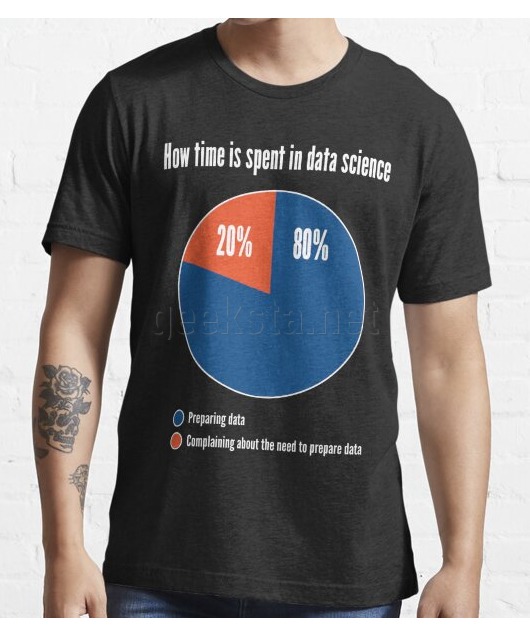
How Time is Spent in Data Science - Funny Pie Chart Design

Want a custom version of this design? Send me a request.
Data scientists spent a lot of time preparing data in order to analyze it and they like to point out how much time goes into this process. Are you one of those? Then get this design on a shirt, sticker, mug or other product to show at work and data science events. A design with a joke only data scientists will understand. It consists of a pie chart showing how much time goes into preparing data and how much into complaining about the need to prepare data.
Buy products with design:
amazon.com amazon.co.uk redbubble.comℹ️ Please see the respective shop pages for details about available colors, product types and prices. The sizing charts will help you pick the right size for you or the lucky person in case you want to buy a gift.
You may also like
Design published: by Ramiro Gómez
This design is available from the shops linked above. Available product options (size, color, type) and buying conditions differ across stores, so be sure to review them before you buy a product.
Disclosure: External links on this website may contain affiliate IDs, which means that I earn a commission if you make a purchase using these links. This allows me to offer hopefully valuable content for free while keeping this website sustainable. For more information, please see the disclosure section on the about page.


